
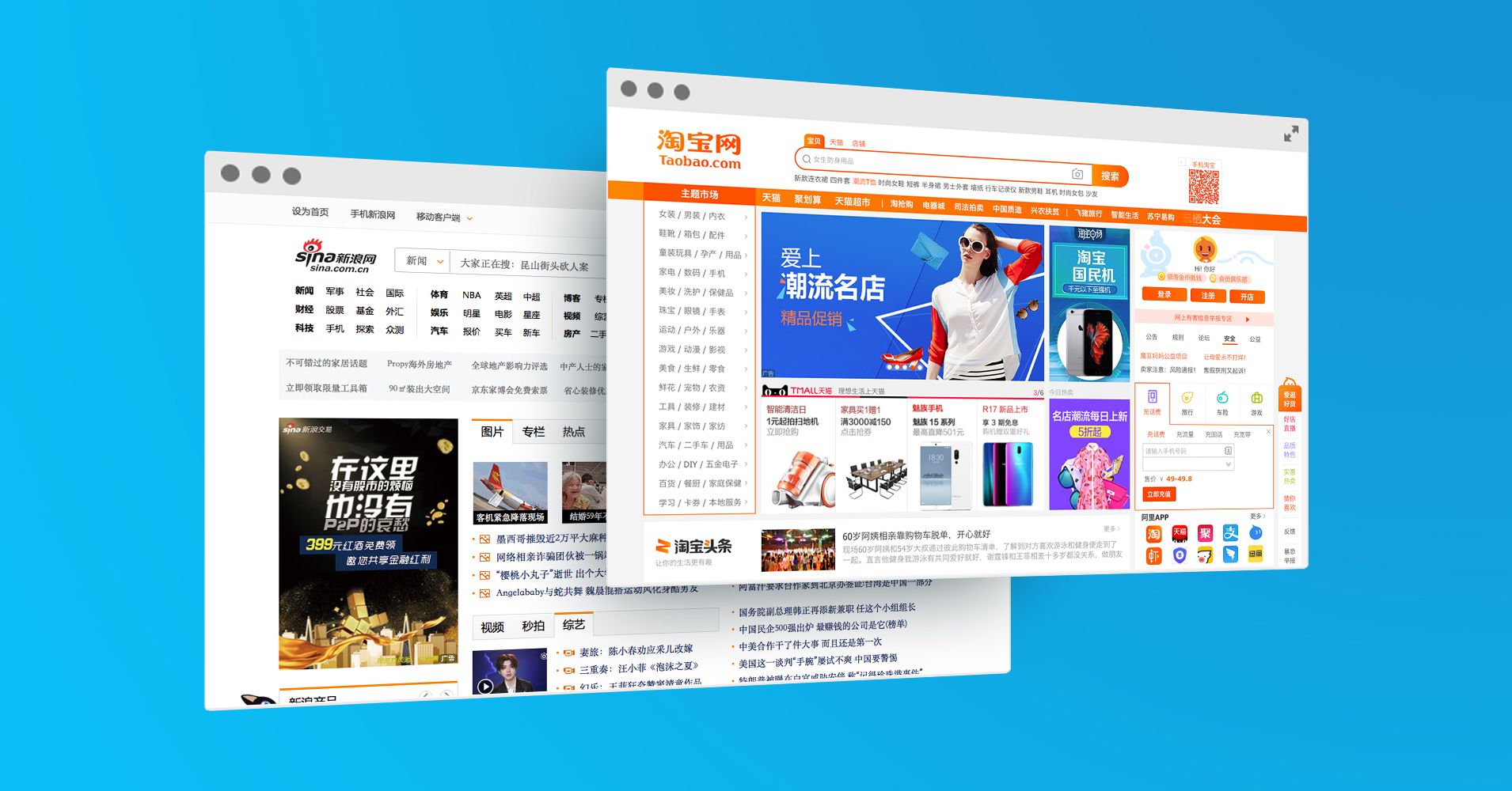
Chinese websites often look overly busy to the eyes of Westerners. Compared to most western websites that are inspired by minimalist Scandinavian design, Chinese websites always appear rather cluttered and overwhelming to the initiated. Here are some design differences between the East and the West:
- Chinese language: there are no spaces in between characters, so they always appear in big chunks and paragraphs. Also, Chinese characters are composed of strokes, with 10 strokes in one character on average, therefore, they certainly look denser than letters, looking rather visually crowded. Straplines and slogans tend to be longer, including having comma’s, as the language is complexer.
- Lots of links: this is due to some Chinese regions have relatively slower internet speed, so those numerous direct links on the web page allows easier search and access to information. Also, “one-stop service” is culturally favoured in China, making a site more convenient and accessible.
- Many Colours: Most Chinese websites employ the use of imagery, animations, and/or video clips to catch the audience’s eyes. In the visually competitive landscape, one needs to stand out.
For our Western clients creating sites for China, the balancing act is to combine Western brand with Chinese visual culture, just like when we designed the Chinese Website. It’s clearly an iconic British brand but the design is vyr much ‘Made for China’. And it works.
Want to know more about adaptions and creations of western brand building in China? Speak to our Design Team> hello@qumin.co.uk